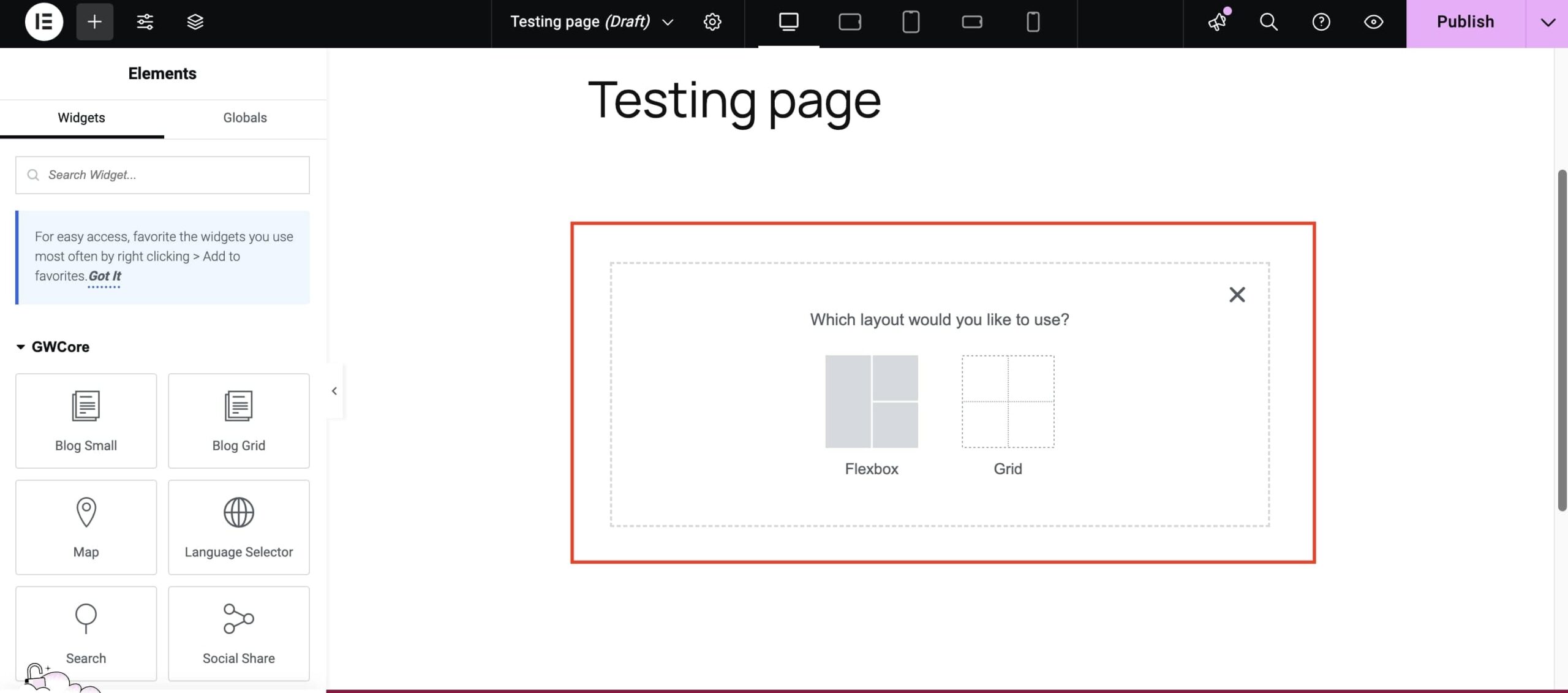
Have you used the Elementor builder lately? In the last year, Elementor has made great progress in the new Containers feature, which is already a great way of building websites easily in WordPress. Since version 3.25.0, the Container feature activates both the Flexbox and Grid layout. So, you can now use both in your website development. But which one should you use for your projects, and how do they differ?
Therefore, let’s see in more detail what the Flexbox and the Grid Containers are, the benefits of each one, and see how to find out in which case you should choose each one.
What are Flexbox Containers in Elementor?
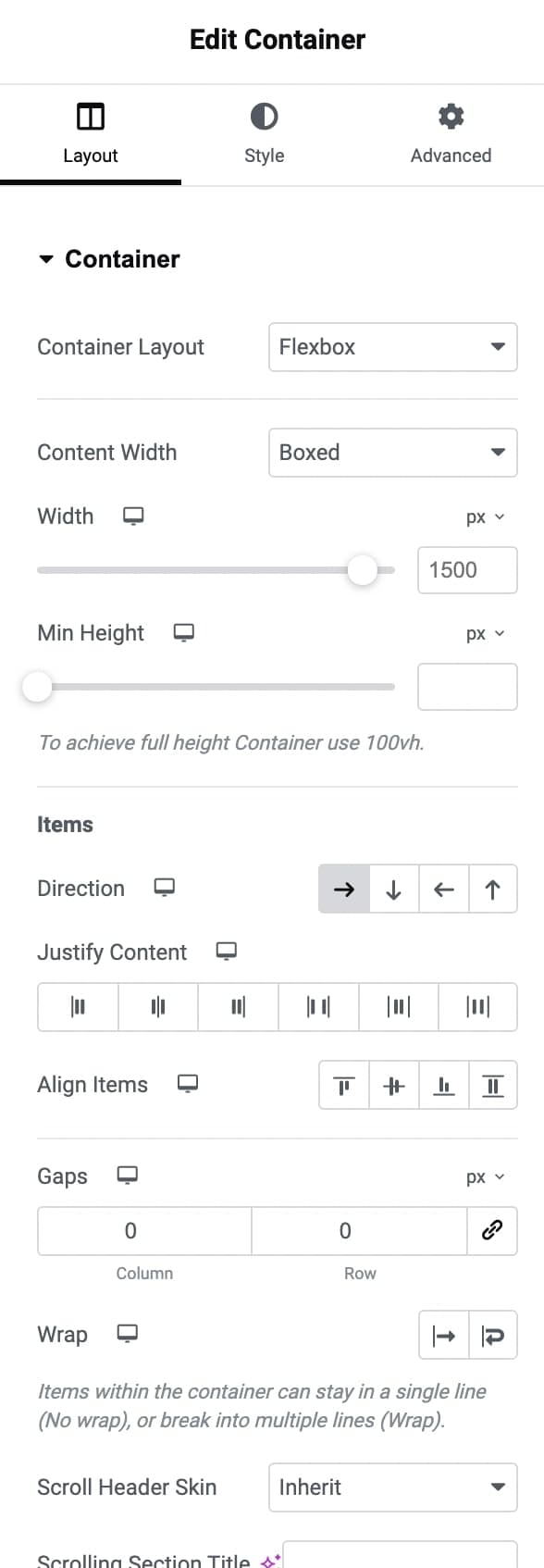
Flexbox Containers in Elementor is a new layout feature that allows you to design web pages using the CSS Flexbox model. Traditionally, Elementor relied on Sections and Columns to structure layouts. While effective, this structure could get complex quickly, especially when building intricate designs with many nested elements.
With Flexbox Containers, Elementor moves beyond the Section-Column model and embraces a modern layout system that’s more flexible and efficient. Flexbox Containers organize content along a single axis—either as rows or columns—allowing for easier alignment and distribution of elements. This structure keeps the design cleaner, reduces the need for nested elements, and enhances page performance.
In essence, Flexbox Containers make it easier to create layouts where items need to align in a row or stack in a column, giving you a more streamlined, responsive approach to design.
What are Grid Containers in Elementor?
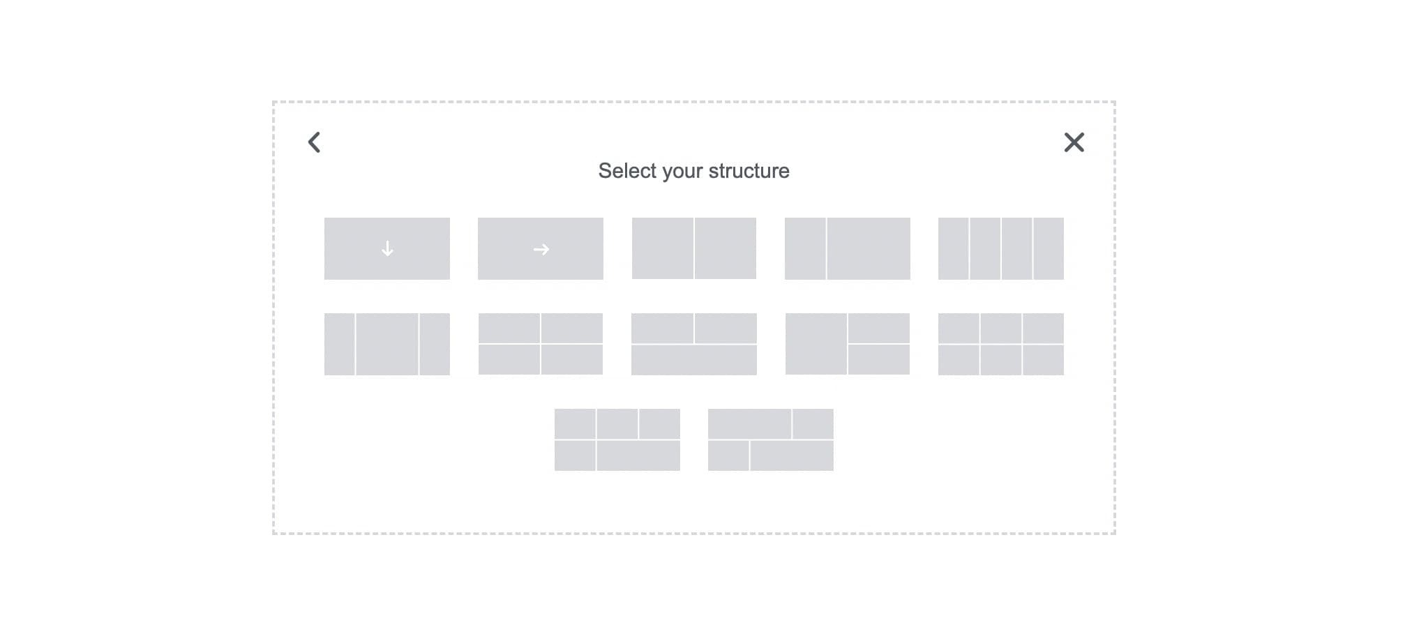
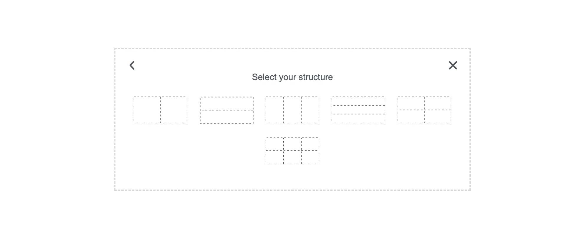
Grid Containers are another layout option in Elementor that lets you arrange content within a grid structure. Unlike Flexbox, which aligns items along a single axis and allows the user to define the layout, Grid Containers allow for a two-dimensional layout. This means you can control rows and columns simultaneously, making it easier to create aligned layouts like galleries, dashboards, or content-heavy sections of symmetric rows and columns.
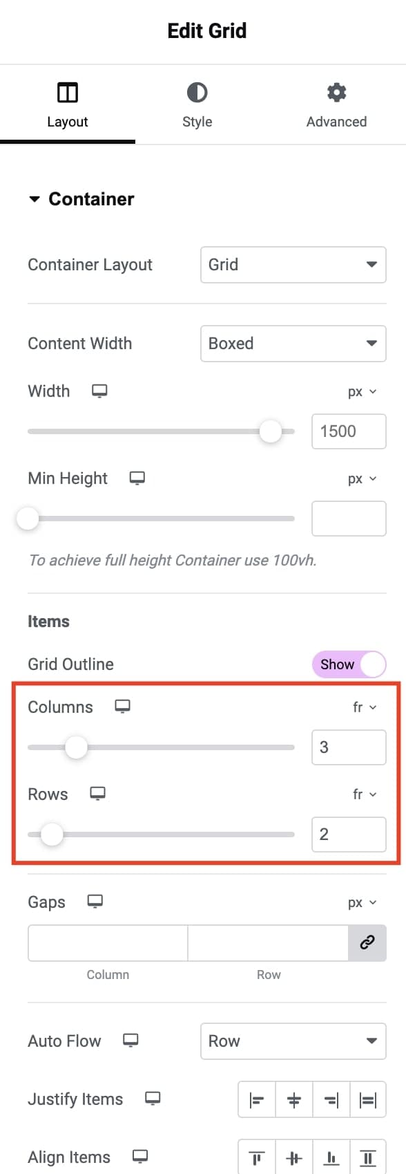
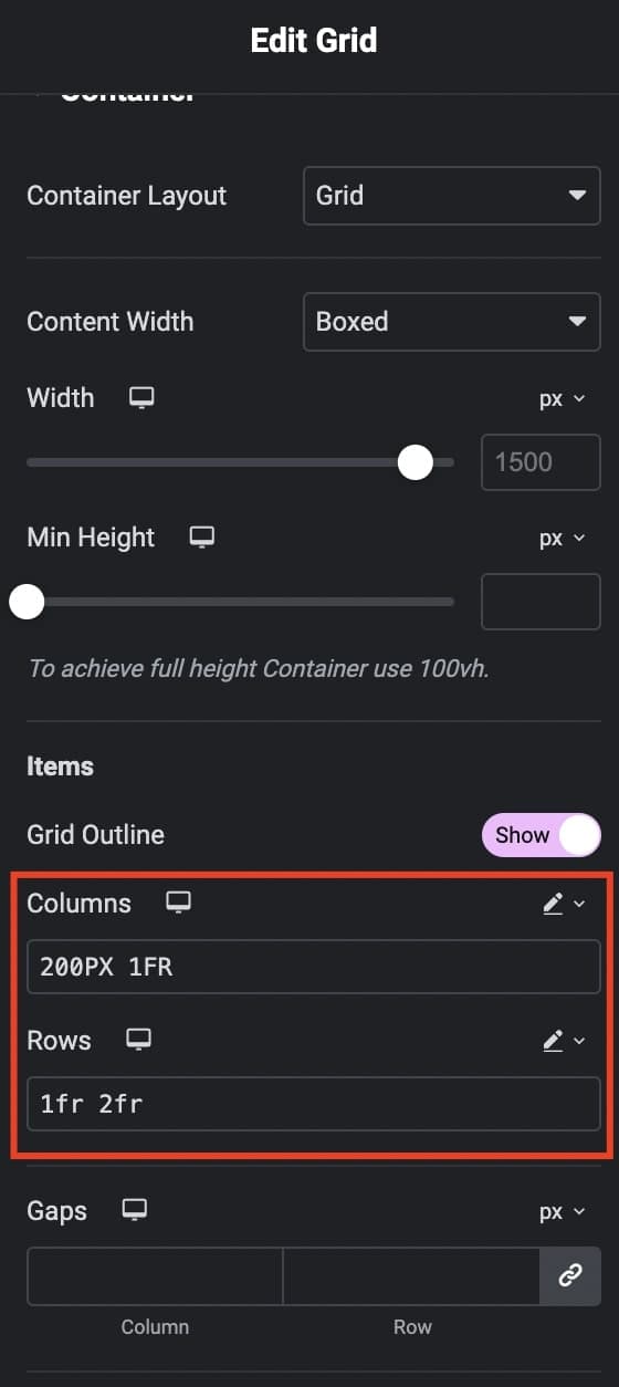
With Grid Containers, you can set the Container Grid and Minimum Height. Whereas you can specify the exact number of rows and columns and control the size of each row and column by selecting the custom rows and columns measurement.
Key Benefits of Flexbox Containers
Improved Page Performance: Flexbox Containers reduce the number of nested elements in a layout, enhancing page performance. Traditional Section-Column layouts often result in multiple nested layers, which can slow down load times. Flexbox minimizes this by placing elements directly within a container, reducing the HTML output and speeding up the page.
Enhanced Responsiveness: Flexbox Containers make designing responsive layouts easier. You can set elements to align in a row or stack in a column and control how they should adjust on different devices. Flexbox’s ability to wrap elements within a container makes creating layouts that look great on any screen size easy.
More Control Over Alignment and Spacing: Flexbox Containers offer precise control over the alignment, spacing, and order of elements within each container. This means you can control how items align horizontally or vertically without adding additional columns. Flexbox is especially effective for single-direction layouts requiring flexible, responsive arrangements.
Streamlined Workflow: With Flexbox Containers, your layout structure remains organised and straightforward, making editing and managing content easier. This is especially helpful when working with clients or revisiting older projects, as there are fewer nested elements to navigate.
Key Benefits of Grid Containers
Structured Two-Dimensional Layouts: Grid Containers shine when you need to organize elements in both rows and columns simultaneously. This two-dimensional structure allows for designs, such as galleries, portfolios, or product displays, where elements should align both horizontally and vertically.
Precision with Row and Column Sizing: With Grid Containers, you can set exact widths for columns and heights for rows, which provides more control over spacing and alignment. This makes it ideal for structured designs where each element’s position and size must be clearly defined.
Improved Responsiveness for Complex Layouts: Grid Containers make adjusting layouts for different devices easy. You can define grid layouts for each device type (desktop, tablet, mobile), allowing for a structured, consistent look across screens. This level of responsive control is ideal for layouts that need to retain a fixed structure.
Better Layout Management: Grid Containers allow you to easily adjust the placement of individual elements within the grid, making managing complex layouts more straightforward. This clarity and flexibility are helpful in content-heavy sections or pages where organization is key.
Flexbox vs. Grid Containers: Key Differences
Although Flexbox and Grid Containers both offer advanced layout capabilities, they are optimized for different purposes. More specifically:
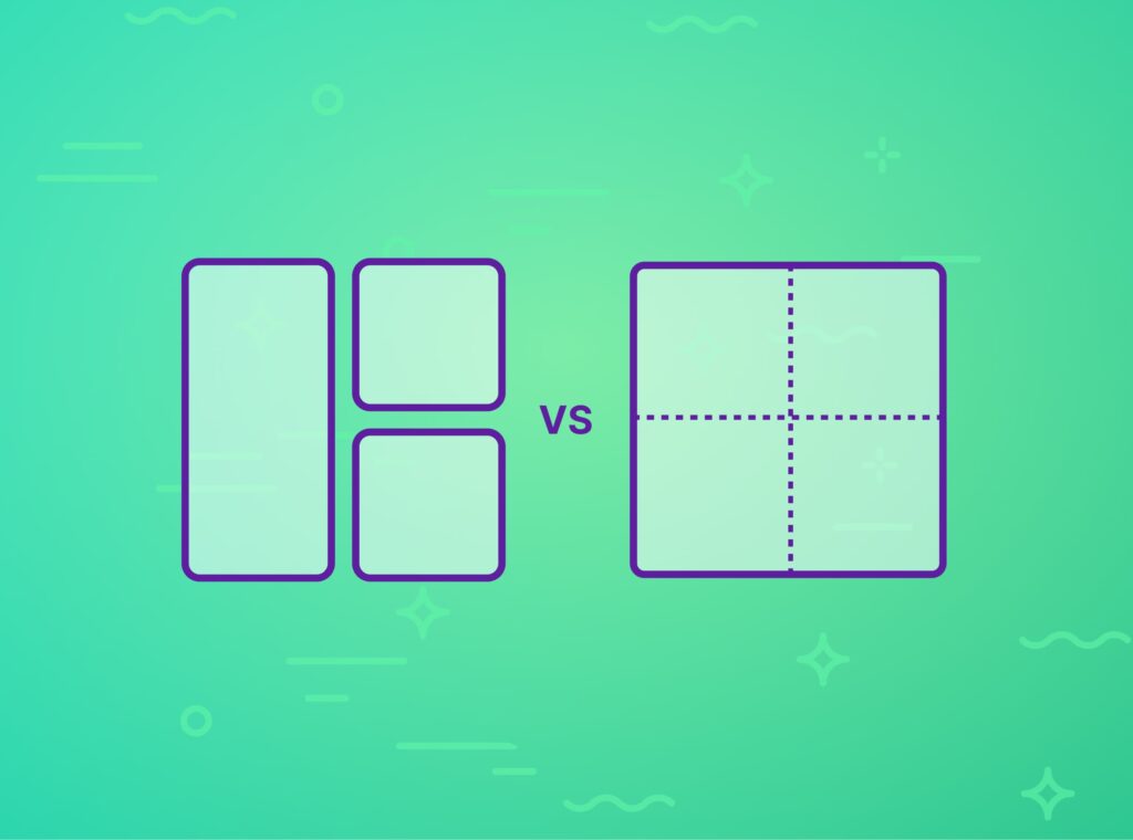
1. Single-Dimensional vs. Two-Dimensional Layouts
- Flexbox: Flexbox Containers organize items either horizontally (row) or vertically (column).
- Grid: Grid Containers manage both horizontal and vertical layouts, making them ideal for more complex, structured designs.
2. Alignment and Spacing Control
- Flexbox: Flexbox Containers allow items to align and distribute along one axis, making them ideal for flexible arrangements like button groups or hero sections.
- Grid: Grid Containers provide control over row and column dimensions, allowing precise control over the placement and span of each item. This control is perfect for creating layouts that need structure and organisation.
3. Responsive Design
- Flexbox: Flexbox is naturally responsive and lets items adjust based on container width, making it ideal for layouts that should rearrange themselves based on screen size.
- Grid: Grid Containers also support responsive design but are typically used for layouts that need a more consistent structure. You can set different grid layouts for mobile, tablet, and desktop views, keeping a consistent grid appearance on all devices.
4. Content Reordering
- Flexbox: You can reorder elements within a row or column without changing the HTML structure, useful for responsive designs where element order may need to shift.
- Grid: Grid Containers offer more specific control, letting you place items in precise locations within the grid. This level of control is helpful for complex layouts without requiring changes to the underlying HTML.
5. Ease of Use and Setup
- Flexbox: Generally easier to set up for simple layouts that need items arranged in a line or stacked in a single direction.
- Grid: Grid requires a bit more setup to define rows and columns, but it’s worth the extra effort for highly structured layouts that benefit from aligned positioning.
Last, of course, you can use both Flexbox and Grid Containers, depending on the layout you need for each section.
Practical Use Cases for Flexbox and Grid Containers.
Practical Use Cases for Flexbox vs Grid Containers in Elementor
Flexbox Container Use Cases
- Centered hero sections: With Flexbox, you can center a headline, subheadline, and call-to-action button within a single container.
- Complicated layouts: Use Flexbox to arrange items of different sizes on the same row or column.
Grid Container Use Cases
- Image Galleries: Grid Containers are perfect for displaying images in an organized layout. You can adjust the number of images appearing in each row.
- Pricing Tables, Icon Boxes, and similar widgets: Grid containers allow for precise control of layouts that need structured columns and rows, such as pricing plans and icon boxes.
To sum up
Flexbox and Grid Containers in Elementor provide powerful tools for creating responsive, modern layouts. Flexbox is ideal for row or column layouts, while Grid Containers excel at building structured designs. If you understand the strengths of each, you can make better decisions about which layout tool to use, improving both the design and functionality of your websites. Elementor’s Flexbox and Grid Containers will help you create designs that are visually appealing, efficient, and easy to manage on any device.
Are you looking for a theme that works seamlessly with Elementor? Check out our latest theme, WeShop. It is designed to take full advantage of Elementor’s powerful features, offering unparalleled flexibility and ease of use. Start building stunning websites today!