Smartphones are becoming increasingly popular, with more and more people using them to access websites. As businesses continue to grow, they need to adopt mobile-friendly practices. It is increasingly important for website visitors to be able to view your site on their mobile devices. This makes the experience more comfortable for your customers and allows you to compete better with your competitors. To achieve this goal, you should be able to view your website’s mobile version before the launch.
What is a website mobile version?
A website’s mobile version is its design, layout, and functionality in mobile browsers. In other words, it is the responsive web design of your website to look appropriate and function optimally on all devices. Mobile versions of websites are designed to be compatible with devices such as smartphones and tablets.
Why you need to view the website’s mobile version
Having a website mobile version is necessary nowadays. Almost half of a website’s visits are from mobile devices. So, you’re at a disadvantage if you can’t make your website look good and work well on a mobile device.
First, it makes the experience more comfortable for your customers. By providing them with a mobile-friendly version of your site, you make it easier to navigate and find what they are looking for. By creating a mobile version of a website, businesses can reach more customers, provide better user experiences, and drive more traffic. This can also lead to increased conversion rates since customers will be more likely to take action if they are comfortable with the site.
Second, having a mobile-friendly website is crucial for SEO. Google is giving more weight to mobile-friendly websites. So if you want your website to rank high in SERPs, it will need to be responsive.
Additionally, even if you use a responsive theme, there are options that you should consider to improve the web design for smaller screen sizes. Last, some WordPress page builders and the Gutenberg editor offer a way to preview and modify the page in responsive mode.
So, if you don’t want to make tests on a live website and test the website on actual mobile devices, then you should check the mobile version from your desktop.
Below we will see three different ways to check any WordPress website’s mobile version on a desktop.
How to test the mobile version of a website
There are three different ways to view the responsive version of your website in WordPress.
1. Browser Developer Tools
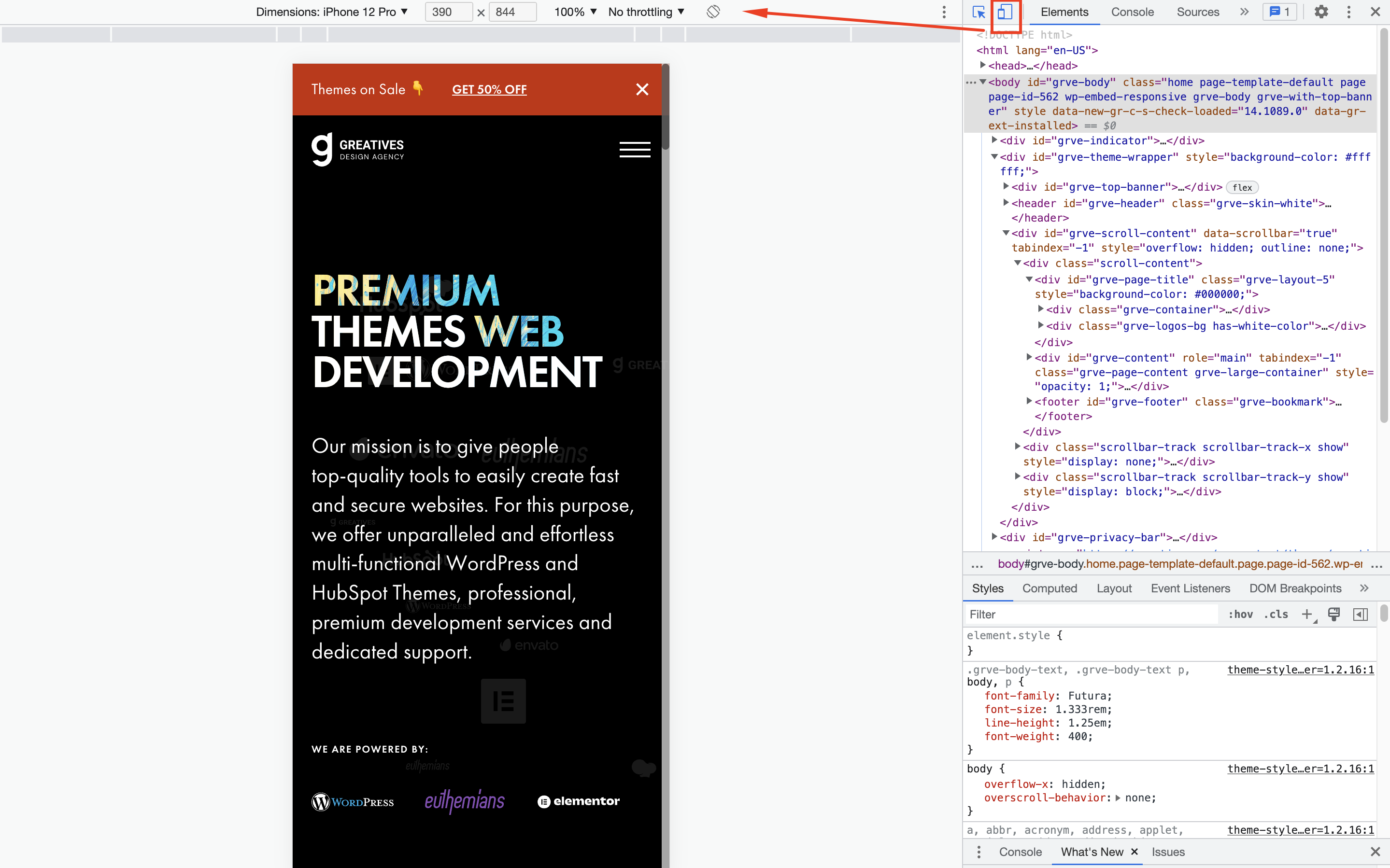
All modern browsers provide the “Developer Tools” option for testing, debugging, and creating websites. You can view your website’s different assets from these tools and see how they are displayed on different devices.
For example, in Chrome browser, right-click on the page and select Inspect. The Developer Tools appears, and you need to click on the mobile and tablet icons on the top to open the device toolbar. Then you can view the web page in specific screen dimensions by selecting the specific device and toggling between portrait and landscape modes.
2. Browser Extensions/Add-ons
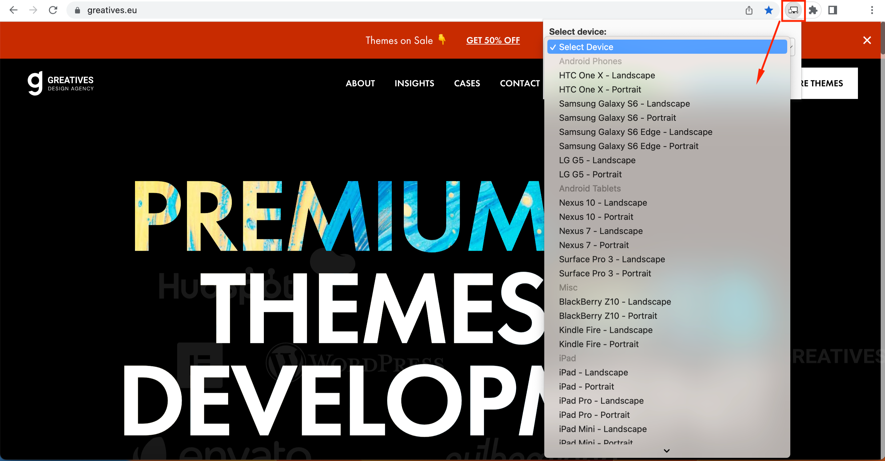
Users can also employ browser extensions to view a page on multiple display dimensions. These browser applications can work as a simulator and reproduce views of different devices, such as tablets and smartphones. In some of these extensions – including Mobile emulator for Firefox and Responsive Web Design Tester for Chrome – you can select specific Android and Apple devices to test page layout and functionality.
For example, once you have installed the Responsive Web Design Tester extension, you can change the browser window size depending on your chosen device. So you can see the entire web page without any scaling issues. Also, you can add or remove specific devices from the options.
WordPress Customizer
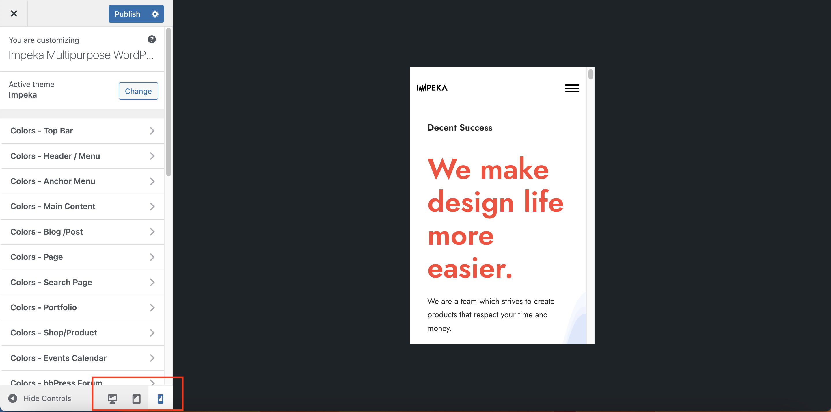
Another way to view a page in responsive mode is to use the WordPress Customizer. Go under Appearance > Customize or click Customize from the top toolbar when viewing a page.
You can select desktop, tablet, and mobile screen sizes to see the page content look. This method is not always accurate and can be more effective in simple design layouts.
Conclusion
Viewing and fixing your website’s mobile version on any device is a great way to make it more accessible and user-friendly. When your website is live, check on actual mobile devices to make sure everything you’ve created is working as it should. We hope this article has helped you find the easiest and safest method to make your website fully responsive.