In recent years, an influential trend has appeared in web design—the use of pastel colors. These soft and relaxing color hues are pleasant for the eyes and give a calming user experience that keeps visitors engaged. That is why the pastel color palette is used more often year by year. This post will present 4 examples of websites with pastel color schemes created with Greatives themes.
So, let’s embark on this journey of serenity and calmness with 4 real-case examples!
The Rise of Pastel Tones in Web Design
Web designers are increasingly turning to pastel colors for their projects. The versatility of pastels allows for a wide range of expressions, from playful to sophisticated. Beyond aesthetics, pastel colors create a friendly atmosphere, making users feel more at ease during their online journey. The combination of colors, the company’s logo and the website’s typography, play a significant role in the overall design and mission.
Pastel colors, with their understated elegance, have become a staple in modern web design, offering a refreshing departure from the past’s bold and vivid color schemes. These gentle hues, inspired by the softer shades of nature, evoke a sense of tranquillity and simplicity. Whether it’s a soothing mint green, a delicate blush pastel pink, or a serene pastel blue, pastels effortlessly infuse websites with a modest charm that resonates with visitors. Beyond their aesthetic appeal, pastel colors contribute to a positive user experience, providing a visually pleasing environment that encourages engagement and ease of navigation. These colors are unique in various industries, from lifestyle and fashion to wellness, nature, and beyond.
What makes pastel colors genuinely remarkable is their versatility in expression. They adapt seamlessly to diverse themes and moods, allowing designers to convey a spectrum of emotions and brand identities. From the playful and imaginary to the airy and minimalist, pastels can be tailored to suit the unique personality of each website. Indeed, these colors are not just a fleeting trend but a powerful language that continues to shape the visual landscape of the internet. This movement can be seen not only in website design but also in graphic design as a whole.
Manon Jewelry
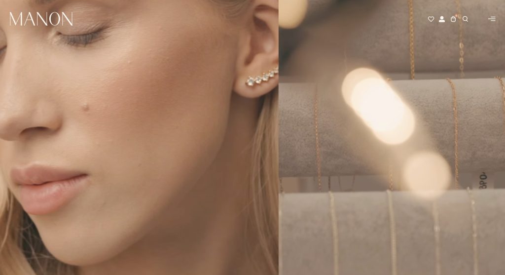
Manon Jewelry has an impressive e-commerce website that has mastered using beautiful pastel hues. The elegant combination of soft pink and gold-brown on Manon Jewelry’s website exudes sophistication and femininity. Pastels create a delicate and gentle aesthetic, perfectly reflecting the beauty and elegance of their jewellery pieces.
The use of soft pinks adds a touch of sweetness and femininity to the website. It gives a romantic and dreamy vibe, appealing to those who appreciate delicate and graceful designs. In contrast, the gold-brown accents add warmth and richness to the color scheme. The earthy tones create a sense of grounding and stability, enhancing the luxurious feel of the jewellery.
Kolokotronis Huile d’Olive
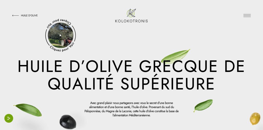
The website of Kolokotronis Huile d’Olive showcases a captivating design distinguished by its elegant combination of colors. The primary colors are black and green with a white background. However, on the homepage, you can also see pastel green and gold-brown hues.
The green shade exudes freshness, vitality, and a connection to nature, reflecting the brand’s commitment to delivering premium quality and organic olive oil products. The choice of gold-brown as a secondary color adds a touch of sophistication and cosiness to the overall aesthetic. This shade seamlessly complements the green, creating a harmonious and inviting atmosphere on the website. Moreover, the green and gold-brown hues perfectly align with the essence of Kolokotronis Huile d’Olive as a brand, evoking images of lush olive groves, earthy landscapes, and the golden radiance of Mediterranean sunlight. These colors enhance the website’s aesthetic appeal and establish a solid and distinctive brand identity in the olive oil industry.
twentyten
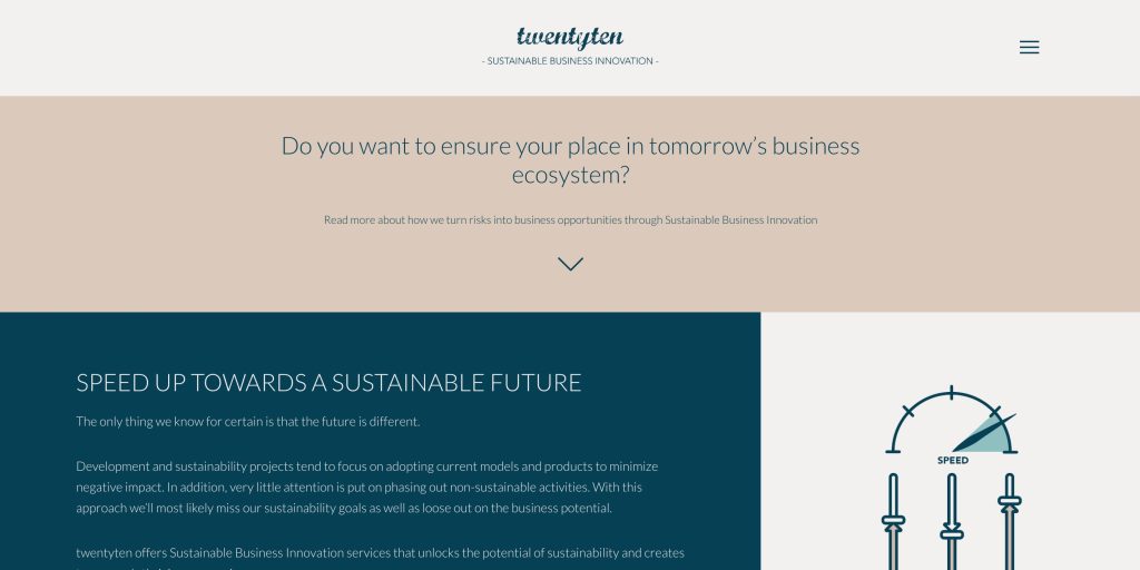
The TwentyTen – “Sustainable Business Innovation” is an aesthetically pleasing website incorporating a color scheme of pink pastel and a dark blue-green hue. The pink pastel brings a soft and delicate touch to the design, while the dark blue-green shade adds depth and sophistication. This combination creates a visually appealing contrast that catches the viewers’ attention and engages them with the content. The overall color palette exudes a sense of innovation and sustainability, aligning with the website’s theme and purpose.
Efi Roboti
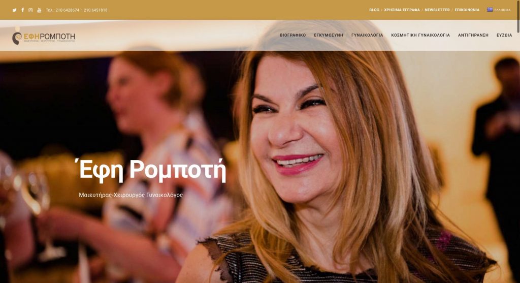
This website is for an obstetrician-gynaecologist specialist with a turmeric brown pastel color. Efi Roboti’s website for her gynaecology practice in Athens features a warm and inviting color palette with this brown pastel shade. This color choice adds a touch of warmth and femininity, creating a soothing and comforting atmosphere for patients. Warm pastel tones also give the website a modern and stylish appearance. Additionally, the warm and inviting color palette helps to create a sense of trust and familiarity for potential patients. The color choice also aligns well with the nature of the gynaecology practice, as it suits womanhood.
Conclusion
These four cases exemplify the power of pastel colors in web design. Pastel hues have demonstrated their ability to serve as adaptable resources for crafting captivating and balanced virtual engagements, regardless of the nature of the brand, be it a fine jewellery boutique, an olive oil enterprise, a serene wellness centre offering life coaching services, or a medical practice specializing in gynaecology and many more. As you explore the above websites with pastel colors, consider how this style could elevate your projects. Let’s continue to inspire and be inspired by the ever-evolving world of web design!