Web design color trends are continuously changing through the years. Although some tendencies or classic choices remain current for extended periods, there are always new trends yearly. These trends sometimes are the same in many fields, such as web design, graphic design, decoration, and fashion. When choosing colors for your website design, consider the emotions and messages you want to convey and select colors that align with your brand values and personality. The website color scheme can match your brand or combine a complementary color with the brand. As we enter 2023, it’s time to explore the captivating realm of color trends that are taking the digital landscape by storm. We have already discussed the top web design trends for 2023.
So, this article will focus on the latest color palette trend that can spark creativity for your website’s design.
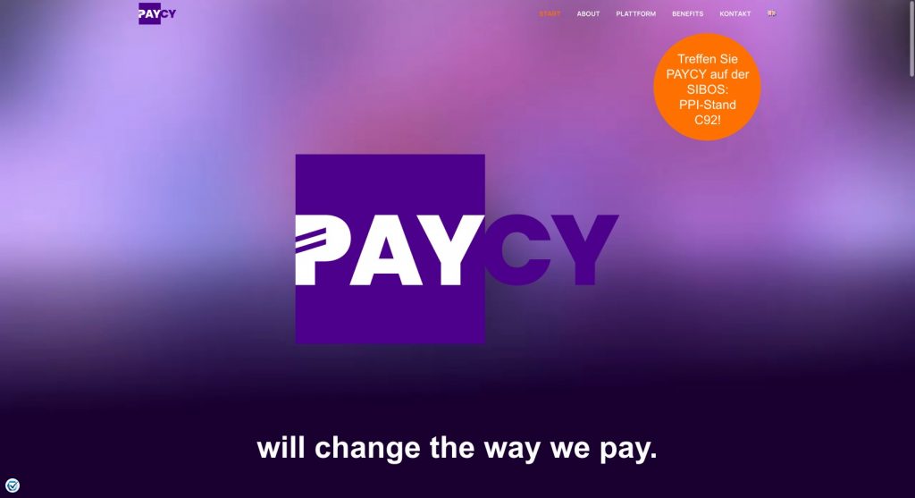
Vibrant and bold colors
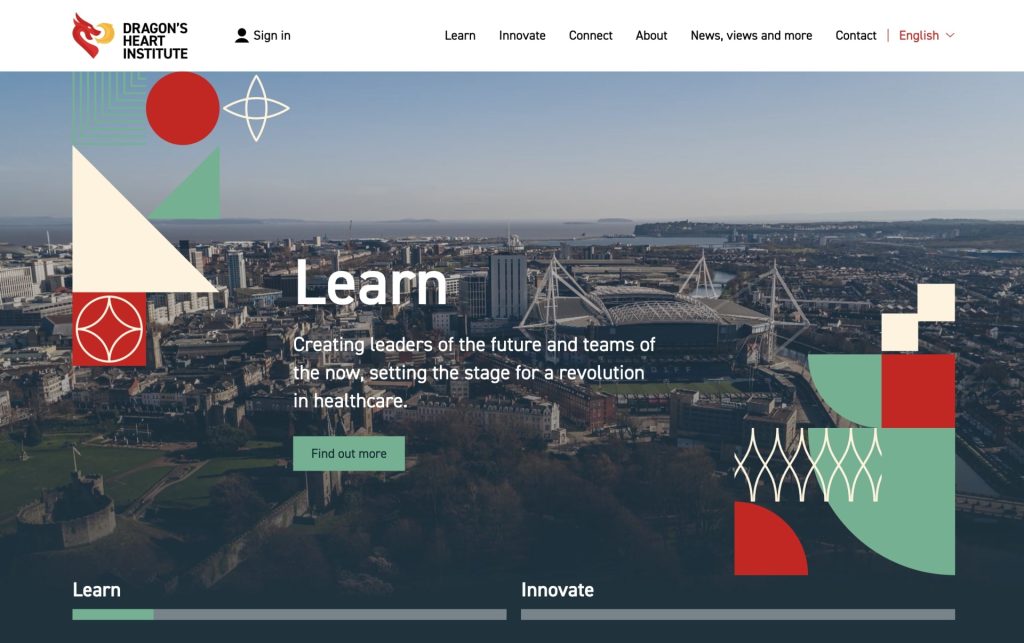
Recently, web designers have increasingly embraced vibrant and bold color choices to make websites more visually engaging. This trend continues in 2023, with designers experimenting with rich and intense hues. By harnessing the power of these colors, web designers can create visually engaging and memorable experiences that captivate users and leave a lasting impression.
It’s worth noting that when working with vibrant and bold colors, it’s essential to consider the website’s overall aesthetic and target audience. Some industries or brands may benefit from a more restrained color approach, while others thrive with a dynamic palette. Ultimately, this palette should align with the brand’s messaging, user experience goals, and design objectives. Some of these colors for 2023 are green and orange hues, powerful purple, pink, and the color of the year: magenta.
Gradient and duotone effects
Gradients and duotones have been popular in web design and will remain relevant in 2023. These effects involve blending multiple colors or using two contrasting colors to create a striking visual impact. Gradient and duotone effects are popular design techniques that use multiple colors to create visually striking and engaging experiences.
Gradients involve a smooth transition between two or more colors. They can be applied to backgrounds, text, buttons, or other design elements to add depth, dimension, and visual interest. Duotone uses two contrasting colors to create a visually impactful effect. It can be achieved by converting an image to a grayscale and then applying two colors to replace the highlights and shadows. Duotone effects are perfect for a bold and dramatic look, adding a sense of modernity and sophistication to the design.
Dark mode and neutrals
Dark mode interfaces have gained significant popularity, providing a sleek and modern look. In addition to dark mode, neutral color palettes with muted tones and soft pastels remain popular for a clean and sophisticated aesthetic.
Dark mode refers to implementing a color scheme predominantly composed of dark or black backgrounds with light-colored text and elements. It provides an alternative to the traditional light mode, which uses light backgrounds and dark text. Some key aspects of the dark mode are reduced eye strain, visual focus, and battery savings, so for this reason, dark websites have been very popular in the last few years.
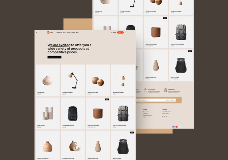
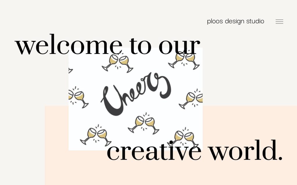
Neutrals are a color palette that includes soft, muted, or earthy tones, often found in shades of grey, beige, taupe, and pastels. They have become popular for their ability to create a clean, elegant, tranquil, and timeless aesthetic. Also, neutrals are widely used in web design because of their simplicity, minimalism, versatility, timelessness, accessibility, branding, and professionalism. A representative example you will see on our latest theme, WeShop’s demo page.
Retro and vintage colors
Retro and vintage-inspired color schemes have been making a comeback in recent years. Designers are incorporating nostalgic color palettes reminiscent of the ’80s and ’90s to evoke a sense of nostalgia and add a unique flair to websites. Retro and vintage colors draw inspiration from past eras, particularly the 1980s and 1990s. They often feature bold, saturated hues, playful combinations, and a distinct color palette that captures the essence of retro aesthetics.
These colors can be contrasting combinations and choices like electric blue, neon, and other vivid colors famous in the previous decades.
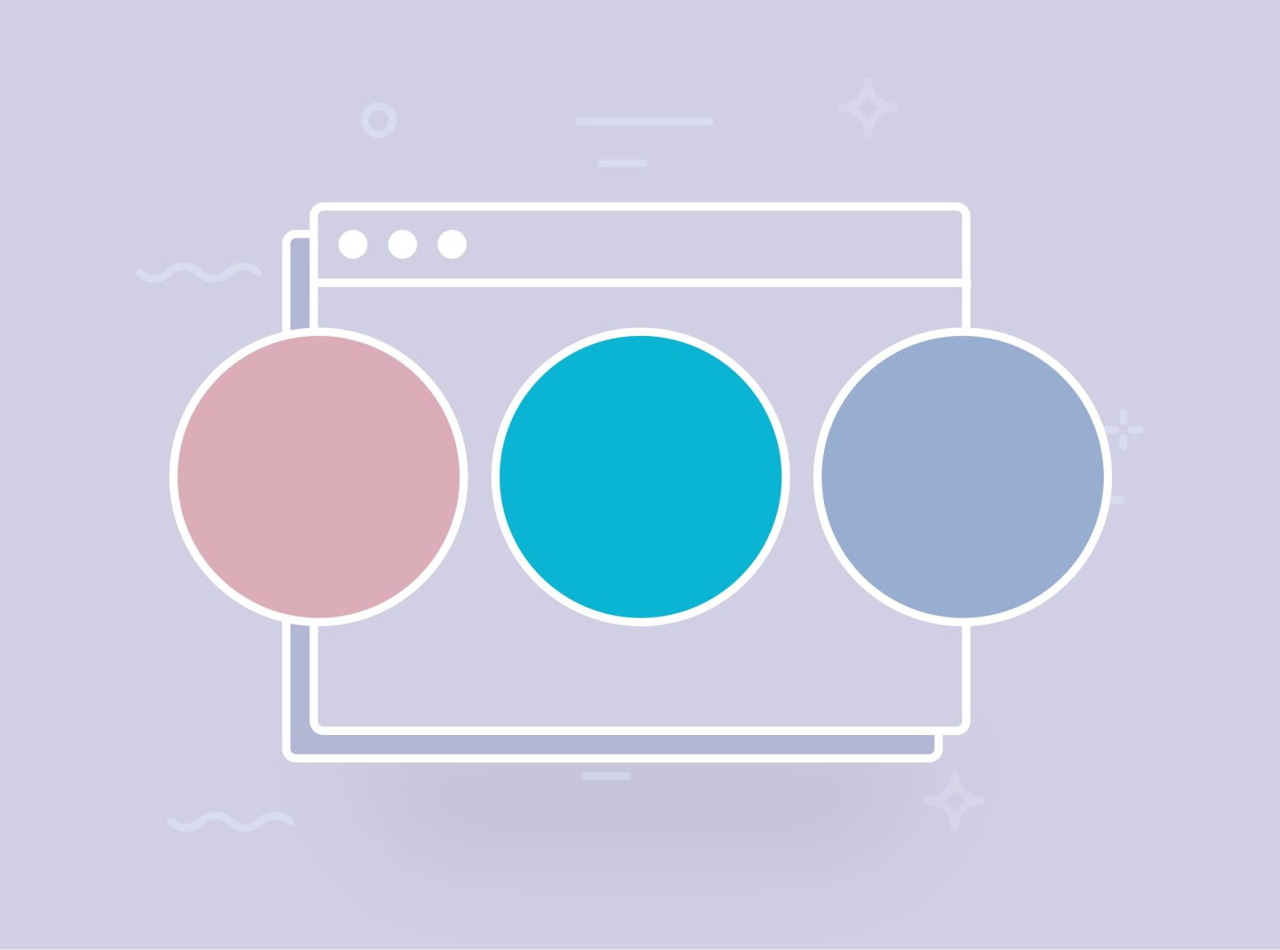
Minimalism with pops of color
Minimalistic designs with a limited color palette, typically black, white, and shades of grey, are prevalent in web design. To create focal points and add visual interest, designers often introduce vibrant pops of color strategically, drawing attention to specific elements.
Minimalism focuses on simplicity to provide a clear message to the visitor. Combined with pops of color, it creates a visually striking contrast that draws attention to specific areas or elements within a design.
Last, this part includes monochromatic websites with color accents. For example, black, white, and grey color schemes with vivid colors in buttons or headlines.
Conclusion
In the ever-evolving world of web design, color plays a pivotal role in shaping the user experience and conveying the brand’s message. It has the power to evoke emotions, create visual interest, and establish a unique identity for a website. From vibrant hues to subtle neutrals, the world of web design is alive with many captivating palettes.